Problem
-
There’s no comprehensive overview of Dutch art in the US.
-
There’s a lack of interactive digital platforms for artwork display online.


Representing Dutch Art Across the US
Responsive Website Design for innovative art-viewing experience for Boston Museum of Fine Arts
Duration: 6 weeks
My role: UX Designer, Researcher, Design Strategy
Team: Qingyu Cai, Bonnie Ye, Boston MFA Dutch Art Department
Design Process
For the design process, there are mainly four stages. Among all the stages, research is what we prioritized, and it gave us many meaningful insights and inspirations for our final design ideation. The background research process contains mainly two parts: the case study and interviews. First, we did case studies of other museum websites to learn what design feature is effective and what could be improved. Second, we did user research by interviewing the main stakeholders to understand the different needs and challenges.


A Glimpse of Final Design

1. Problem Statement
“Current museum websites just don’t match up with the physical experience of being inside the museum space; there’s a lack of discoverability and a disconnection between the digital archive and the physical collections. The online navigation is sometimes confusing too…”
—-Interviewee Lee talks about her experience visiting museum websites online
Lack of Comprehensive
Dutch Art Collection in the US
Dutch Art collections exist at many museums, large and small, in private collections and at other sites in the US. However, it is currently impossible to obtain a comprehensive overview of, let alone digital access to all holdings of Dutch art in the US.

Design Goals
The design purpose is to utilize the online platform to tell stories for those interested in Dutch art.
-
Creating easy navigation and customizing personalized collections
-
Customized Design unique to Dutch collections across the US
-
Serving as the online platform to connect to original museum websites and physical museum space
-
Enabling easy updates for more collections

2. Where I Get Inspiration From
There are many existing innovative museum websites around the world, and many gave us inspiration for our design. We did case studies of other museum websites to learn what design features are effective and what could be improved. We select different websites to study based on a series of success matrices: user engagement and interactivity, discoverability of artwork, and the efficiency and usability of searching for artwork. In the end, we narrow it down to three cases to gather insights to learn from.
Lack of interactive online experience
Compared with museum spaces that offer users more interactive experiences, current museum pages fail to attract users by creating such an interaction. This project aims to create an innovative online platform by learning from physical museum spaces while developing a unique virtual experience.

THE RIJKSMUSEUM | Customization feature
The first example is the RIJKSMUSEUM in Amsterdam, which allows users to create their collections of artworks and browse images of similar color palettes. This way, users feel more engaged in collecting artworks, while the museum can generate more revenue by selling those customized creations.

3. USER RESEARCH
The primary user research method for the project is the user interview, which focuses on what people say and why, in other words, the attitudinal and qualitative facts. Four groups of people were interviewed, including four groups of museum visitors at Harvard Art Museum representing the general public, one art student in Germany, two scholars at Harvard Art Museum representing artists and scholars, the director of technology & Digital Strategy of MIT Museum representing the museum technology team, and the project’s client: Christopher D.M. Atkins, Director of MFA’s Center for Netherlandish Art.

.jpg)

Brainstorming
After documenting the interviews, we used user affinity mapping to synthesize ideas from various groups of people in terms of their reasons for using the museum website, needs, difficulties, and suggestions. We are surprised to find similarities and great ideas, which leads us to our next step of design thinking.

4. DESIGN
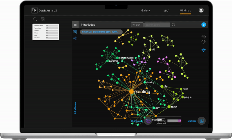
For the design development, we first explored interface ideas on sketches. We did iterations about different ways of displaying collections and tested in Figma to make low-fidelity wireframe prototypes. Next, we extracted and cleaned up data from different museum collections. Lastly, we tested different tools for data visualization, including TimeMapper, Palladio, and InfraNodus.
PINTEREST | Recommendation feature
The second case study is the Pinterest website, which features its homepage gallery view to display image recommendations. The homepage is different for each user based on the user’s search habits and preferences. This way, users can find more inspiration by surfing the homepage recommendations.

Homepage
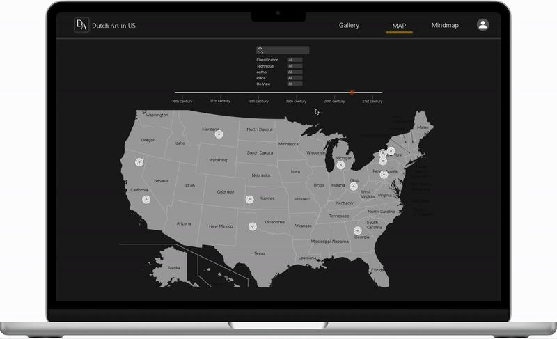
The interface design mainly contains two parts: a homepage and single work. The homepage has three main featured views: gallery, map, and mind map. Gallery view enables users to explore Dutch artworks more freely. By integrating a timeline into the map view, users can explore Dutch artworks by filtering dates and visually see the distribution of works in the United States on a map. Besides, a mind map view with keywords and themes about artworks can help users to understand the relationship among those artworks.

Gallery
Increase artwork discoverability by integrating a carousel display feature to allow user explore art freely.
Map
Enhance the connection between physical museum space and online museum collections. Allow users to more accurately and efficiently search for artwork.
Mindmap
Improve user engagement and interactivity through discovering new relationships and insights about artwork and artists from the mindmap view.
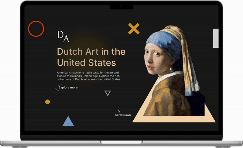
Intro Page
Increase efficiency and visual clarity through split screens. The ‘on display’ feature eases users’ experience before planning a visit to a museum.
Exhibition
Improve user interactivity and deepens users’ understanding about the artwork by providing images to show its real-life scale.
Story
Enriches users’ art learning experience by providing audio and visual media resources related to the art piece.

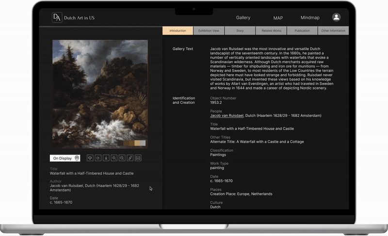
Related Works
Increases efficiency and accuracy in searching for artwork-related information by combining resources from the library and archives. Therefore users do not need to search for details again separately.

User customization
The profile page engages users by allowing them to save and create their own collections. It also allows users to view saved artworks in map view so they can plan their museum tour better
Harvard Art Museum | Clear visual hierarchy
The third case study is Harvard Art Museum. Having a clear visual hierarchy and minimum use of colors to interface and emphasize content is practical. The combination of white, black, and grey as the website's primary colors makes the artwork more prominent. Besides, features including search filters, citations, and IIF images benefit scholars for professional use.

Singlework Page
Regarding single work display, the interface design integrates the split screen idea. On the left side of the interface, users would see a picture of the artwork with basic information. In contrast, on the right side, several tabs allow users to click on, for instance, introduction, exhibition view, story, related works, publication, and other information. Compared to the traditional interface of making users continuously scroll down to check available information, in this way, users can always see the still image on the left side and explore more information on the right side

Going Forward
What I learned:
I learned that even small design changes could have a huge impact on the user experience. The most important takeaway for me is to always focus on the real needs of the user when coming up with design ideas and solutions.
Future Direction:
-
Conduct follow-up usability testing on the new website
-
Identify any additional areas of need and ideate on new features
-
Continuous updates for museum datasets